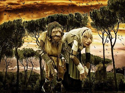


This is one of the stretches yes? This year I wanted to learn how to use photoshop so that I can do more than just auto-adjust - and it's been quite a learning curve so far, with layers and filters becoming easier and learning new things like making brushes and displacement maps. So much more to learn though - so when the themes came to fantasy I decided to take 3 images from 3 different places and merge them into a fantasy picture.
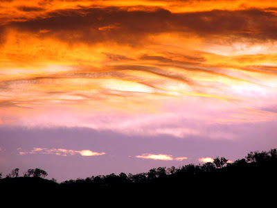
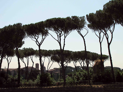
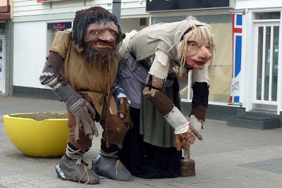
I have shown the three elements (sooc) and the final image - not genius I admit, but it was a learning experience. First - the background - a sunset close to home. Then some trees - I chose some sculptural looking ones from the hills in Rome - I call them 'art deco' trees. I removed the background using the background eraser tool - Magic that! then the final layer - some huge Trolls from Iceland - in the main street of Akureyri there are these fabulous larger-than-life Troll figures (well they are probably the right size for Trolls) so I de-backgrounded them too and layered them on top. Then I adjusted sizes and gave the whole lot a colour filter, then a graduated black layer set to overlay blended their feet in. At the last minute I added some bird brushes in the sky. A learning experience and lots of fun.
Wonderful composite.
ReplyDeleteLove the composition and it really does show how the rigours of political life can effect the candidates. Love the Look!
ReplyDeleteStellar work! I can only imagine how long it took for you to do that--but the results are worth every moment.
ReplyDeleteIt was really fast - mostly because it was an experiment, so I wasn't looking for 'perfect' just having fun. To decide on the three elements was just 'sky shot' - trees or rocks or waterfall? - fantasy figure (and the trolls shot to mind as I only photographed them last OS trip). If I had obsessed I would have got bogged down, but this took less than 20 minutes.
DeleteThat was very well done. I hope we'll see more of your artistry in the future!
ReplyDeletethis is fantastic, very creative...
ReplyDeleteLove that surreal sky...these are so perfect for the theme!
ReplyDeleteI think you did an awesome job! Love how you used the overall toning to blend them all together. I've never used the eraser tool. Now you've opened my eyes to its possibilities...that's what I love about this whole blogging thing!
ReplyDeletethe background eraser is fantastic - takes away the colour you select only - so with sky that is a fairly even colour (you can change the tolerances) and a good contrast for the foreground it's really easy. Trickier when there isn't as much contrast, but still good.
DeleteYes, it's fantastic, love these very well done images!
ReplyDeletePerfect combination of photos to this scarylooking result! If you made this so fast I think you are very talented. Bet you could do wonders with my Wings post!
ReplyDeleteFantastic!! It looks very believable as an illustration!
ReplyDeleteFantastic result....btw I loved the sunset image as a picture anyway ;)
ReplyDelete